Nature Inspired Innovation

I had the absolute pleasure of giving a talk at UXScotland last week with Stu Church on ‘Nature Inspired Innovation – Designing the Future by Using Lessons from the Past’.

The talk emerged from a pub conversation where we both realised we had been mulling over similar ideas and it was great to have a super smart collaborator to work with to bring it to life.

It’s about learning from natural systems and applying those lessons to help to answer challenging questions such as :

  • How much should you innovate?
  • How fast should you innovate?
  • Why do products look so similar?
  • Why might people not choose the most efficient designs?

I think it’s really valuable and enjoyable to look for answers to the problems we face in our work in unexpected places. This talk, if anything else, was a useful reminder that the answers are often hidden in plain sight!

Enjoy!

How to optimise your service experience

I’ve created a method that enables service owners to evaluate and optimise their services based on the things that matter the most to their service users.

The approach focusses on identifying the qualities that your service must offer in order for it to deliver the best experience for the people who use it.

In this short talk I share the background to the approach, the 100 qualities of great service experiences and a simple 5 step method that you can use to optimise your own service experiences.

Short Form Brief Template

I find writing short form briefs to be really valuable, particularly when I haven’t been involved with setting up the project or winning the work.

I find the rigour of attempting to answer important questions really useful to check my understanding, keep me honest and to highlight gaps in my knowledge.

I typically write them as soon as possible after project kick off’s and share early versions with the team to check what I’ve misunderstood, get answers to fill the gaps and critically to created a shared understanding of what we’re trying to do and why we’re doing it.

They are also really useful to refer back to when projects inevitably go a bit wonky as a useful aide memoir and informal contract of sorts.

Here’s a simple template I always start with to help you on your way. Do also read Jared Spool’s brilliant article on the topic ‘The Magical Short Form Brief‘ as it’s the perfect primer.

8< – – – – – – – – – – –

[Project Name]
Short Form Brief
[Author] [Date] [Version]

Project objective 
[Why are you doing the work? What problem/s are you trying to solve? What is the value of solving the problem?] 
 
Scope 
[What is in and out of scope?] 

High level approach 
[What are you planning to do & why? Which roles will be working on it?] 

Hypotheses
[What hypotheses do stakeholders believe are true that you wish to learn more about?] 

Guiding Principles 
[What are the guiding principles that we will use that will govern the spirit of the approach that we take?] 

Assumptions 
[What assumptions have we made that have influenced our thinking and approach?] 

Key Outcomes 
[What outcomes is the project team aiming to achieve?] 

Measures of Success 
[What will you measure that will indicate whether the work has been successful or not?] 

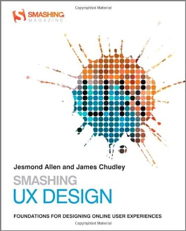
Free download of ‘Smashing UX Design’

Jesmond and I wrote ‘Smashing UX Design’ back in 2012 and after a few years it sadly went out of print.

I quickly regretted giving so many copies away when the prices then soared on eBay! ; )

After finding the PDF of the book during a recent clear out we decided that it makes no sense for it to not be set free!

So enjoy reading ‘Smashing UX Design’! (43mb PDF)

We hope you find it useful!

What are the qualities of a great experience?

Last night I had the pleasure of speaking at the the very first Service Design Bristol meetup.

My talk on ‘Better Service Experiences’ provided the perfect opportunity to share some new thinking around how by identifying the qualities of great experiences we can use them to design better product and services.

Following the talk I published an article on LinkedIn where I share the qualities of great user experiences.

Focus on meeting basic expectations

I remember doing some intranet usability testing years ago for a government agency and hearing employees criticising the search engine asking ‘why doesn’t it work as well as Google?!’

Despite this being an unreasonable expectation given the resources of a government department vs the might of Google its the reality of how we think about the things that we use in our everyday lives.

We don’t need to know (or care) what it takes to make things work we just want them to use them and get on with our day.

Expectations are set by our everyday experiences

Our expectations of how things should work are shaped by our everyday experiences.

Within a typical day we may interact with many different services from a range of different providers.

These experiences set our expectations for how everything should work.

When things don’t work as we expect it can be really frustrating.

Why can’t my local retailer offer next day delivery like Amazon?

Why isn’t booking a swim at my local leisure centre as easy as booking a trip to the tip?

Why can’t I unsubscribe from Virgin Media service as easily as I can from Netflix?

Our expectations are always evolving, which poses a challenge for organisations who falling behind.

Meeting basic expectations can be transformational

Many organisations try to catch up by launching ambitious ‘transformation’ programmes.

These programmes often fail because they are too ambitious, focus too much on technology and fail to acknowledge how much people hate change.

A more realistic and achievable approach step is to focus on meeting the basic user and to execute it really well.

I like to think of it as being brilliant at the basics.

For instance, in order for an e-commerce retailer to meet basic customer expectations it needs to offer competitive prices, good stock levels and hassle free returns.

Failure to meet these expectations will result in them losing customers to competitors.

Organisations should identify these basic expectations and aim to fulfil them really well.

By meeting these expectations, organisations can experience transformative change that will ensure efforts delivers maximum value to their users.

Identify expectations by speaking to your users

Uncovering these expectations is simple – just ask the people who are using your services and those of your competitors.

They will readily share their experiences and expectations, allowing you to provide services that offer them real value and that make their lives easier.

So when evolving services, focus on meeting users basic expectations in order to transform their experience of using the services you provide.
Strategy is broken

Think about the last time you read some form of strategy.

Did it make sense?

Did you feel motivated by it?

Did it provide a clear and logical approach that explains how and organisation will overcome barriers and progress ?

Did it feel achievable?

Can you remember what it said?

I bet the answer to most of these questions is no!

I think strategy in general is broken and needs a redesign.

If an organisation can’t clearly articulate what they plan to do and how they plan to do then they stand no chance of achieving it.

So what does good strategy look like?

I really like the Citizens Advice ‘Future of Advice’ strategic framework. It is easy to read, written in plain English and makes it really clear what they are trying to achieve.

So what are the qualities of good strategy?

Good strategy presents a clear, memorable and coherent plan to achieve an objective.

Good strategy motivates people to work hard to achieve a shared outcome.

Good strategy identifies barriers to progress and outlines a plan to overcome them.

Good strategy is created with, and answers the questions of the people who will execute it.

I’m looking forward to learning more from reading Good Strategy, Bad Strategy by Richard Rumelt.

Using photos to tell stories

One of the most important parts of my job is helping my clients to see the world from the perspective of their customers.

This gives my clients a better understanding of how their customers see the world, what problems they have and how they live their lives.

This understanding helps them to make better product and service decisions that should ultimately result in better outcomes for their customers.

One of the most effective methods we have to help communicate stories about people is photography.

Think how impactful and deliberate the photography that is chosen to accompany news stories and how that influences your understanding, compassion and interest for the people in those stories.

Over the years I’ve played around with using photography in different ways to help clients gain a better understanding of their customers.

One of my favourite examples was inspired by Nick Hand’s excellent Photofilms.

Nick has made hundreds of short (typically 4 minute) photofilms consisting of a series of photos accompanied by the voice of the subject.

They are incredibly powerful, easy to consume and really help you to understand someone in a very short period of time.

We used this method to tell the story of victims of flooding in the UK years ago and it remains one of my favourite projects.

We asked victims of flooding to share their own personal photos of the flood damage in their houses we recorded the stories they told us about the experience.

We combined the photos with their stories and created photofilms creating one of the most impactful user research artifacts I can remember.

They were a real joy to put together and relatively easy to do in proportion to the impact they had.

I’ve been mulling over easier ways of doing these and love the idea of people using their phones to edit and create their own stories (to remove the researcher bias when editing peoples stories – ideas welcome!).

Here’s a great article by Richard Arnott where he interviews Nick Hand and discusses using Soundslides in the context of user research.

Another great example is shown within this film of a digital anthropology student who is sharing a photographic record of her research with the Mohawk nation who live on the border between USA and Canada. I think books of photographs like hers could be such powerful research artefacts for service design work.

Digital Geography

While reading the wonderful ‘The Old Ways’ by Robert Macfarlane I was struck by how much of my digital work borrowed metaphors from geography and wayfinding.

In our work we regularly talk about maps (sitemaps, service blueprints) signage (menus, labelling, links) and journeys (user journeys, journey maps, desire paths and happy paths).

During a recent project with the NHS there were regular conversations about treatment ‘pathways’, service ‘maps’ and how people get lost within the system.

Much of our work is about trying to get people from A to B in the simplest way possible within a landscape (of sorts).

The parallels are clear.

Footpaths in the landscape are created and reinforced by the physical pressure of walking upon the soil. In digital we still create the same pathways through page ‘impressions’ that mark our progress across a digital environment.

Desire paths in the landscape that show the short cuts that people prefer to use over ‘proper’ paths also appear in digital as bookmarks, quick links and algorithmically generated short cuts that reflect the hacks we use to get from A to B more quickly.

It got me thinking what we might be able to learn from established pathways found in the physical world that could be applied to help improve wayfinding in the digital world.

Perhaps ‘The Old Ways’ can be used to help guide how we design the ‘new ways’ of digital wayfinding?

I was in my garage recently and noticed a fascinating trail that an insect had made as it moved across the (very) dusty window.

The shape of the trail reminded me of a meandering river.

It made me think about how many branching patterns like this are found in nature such as tree branches, root systems, frost, river systems, lungs and nervous systems.

As Roger Deakin wrote – ‘A tree is a river. A river is also a tree.’

I discovered that this patterns is known dendritic design and ‘is a universal phenomenon that occurs in every flow system‘.

It reminded me of the shape of many website architectures with their similar patterns of hierarchies of root and branch pages.

This pattern is also found in web analytics, where popular paths through systems are denoted by thicker ‘branches’ whereas less ‘trodden’ routes are shown as much thinner lines.

Presumably flow systems must be regulated by laws of physics that keep them functioning so surely there must be a relationship between the size of their constituent parts that creates these patterns.

After listening to a great podcast about the mathematics of beauty it made me think about using Phi to both design and predict usage of digital systems.

Perhaps web traffic follows patterns that we could predict by applying the golden ratio?

I love the idea of connecting and repurposing ideas from seemingly disconnected worlds. To me this is one of the absolute joys (and critical skillsets) of creative work that comes from an endless fascination and curiosity of the world about you.

It’s all got me thinking – what other patterns from the ‘old ways’ of nature can we apply to the new ways of digital?